There are some photo mistakes I see over and over and over on Etsy. The good news is they’re easy to fix, and can make a huge difference in your photos.
One thing you do need is a decent camera. I have both a digital SLR (a Canon Rebel XT) and a point and shoot (Canon SD1100, now defunct, try the 1200 which is the updated version of my camera), and to tell you the truth I use the point and shoot for 90% of my product photos because it’s handy and takes fantastic photos. I’m a big fan of Canon cameras, but any camera which will let you turn off the flash and has a macro mode (for smaller items) is perfectly fine.
As a side note, a big thank you to all the sellers who were gracious enough to let me nitpick at their photos for the purpose of this article. Visit their shops when you’re done reading!
Just say no to heavy shadows
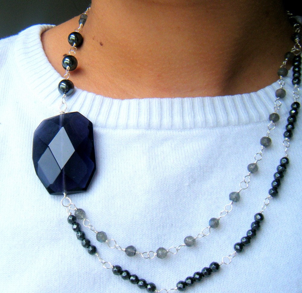
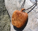 Dark shadows around your items are no one’s friend. They can make the photograph look cluttered and detract from the item itself, sometimes making it difficult to see properly. Moondogfarm has picked a great background for her necklace, but the shadow behind the pendant makes the photo feel uneven.
The trick to avoiding hard shadow lines is to diffuse the light hitting it. If you’re taking photos inside try shining your lights through a thin sheet of white tissue paper, or bouncing the light off a white card instead of aiming it directly at the object. If you take outdoor photos try to take your photos early in the day or later towards the evening rather than in the afternoon when the sun is directly overhead. A slightly overcast or cloudy day can be a great day to photograph.
Beware the crop
Almost every online marketplace will resize or crop your photos in some way. Make sure you take this into consideration with your photos! This can be especially difficult with larger items.
 Bytheway‘s vintage maternity dress features some nice details in the sleeve and collar, but unfortunately Etsy’s center crop means all we see is a navy blue stomach and part of an arm. But as sellers, we don’t have any control over that, so we need to do our own cropping before we upload. By trimming off the bottom of the original photo the crop is pushed up, including the collar and sleeve. You can (and should!) still use the second through fifth images to show the whole item.
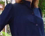 Cropping the image just below the chest changes the aspect ratio of the photo and gives us a much more favorable crop (shown right). Just be careful you don’t cut it too short or you’ll start to lose some of the sides of the photo.
A lot of sellers choose to chop off their model’s heads in photos. Showing your full model (head included) in a photo can be helpful for buyers to get a feel for how the item drapes and falls, and your model’s head buys you some space above the shirt/dress. So when the image is center-cropped you’ll still be able to see the collar and shoulders of the item. Confused? Check out TheVelvetVixen’s photos: here’s the original in the listing, and here’s the cropped version.
Avoid busy backgrounds
 KnotOriginal has clearly put some time into her staging, and her photos are interesting and engaging as a result. She has a beautiful scarf on the left, and a mannequin to display it on… but it’s lost in the complicated background. The horizontal lines of the railing and vertical lines of the ships’ masts draw the eye away from the scarf. Busy backgrounds compete with your item for attention. You want people to see your item, not where you took it.
 But that doesn’t mean you’re doomed to a life of white backgrounds. In fact white backgrounds are best avoided. They can be hard to photograph because they throw off your camera’s metering, and generally aren’t very interesting. Look at the photo on the right (also by KnotOriginal). The leaves in the background add texture without taking away from the item, and the contrasting color help it stand out.
Don’t let your edges show
 If your background is a flat surface or plane, such as a table top or floor, take care not to let your edges show. Like a busy background it can detract from the item, drawing the eye away. The example on the left by andtherainfell is pretty mild – just a corner of a the window peeking in – but it’s still best avoided. And I’ve seen some really painful examples of this browsing Etsy.
 Try changing your angle or crop to get rid of any unsightly edges. If you don’t have the luxury of a huge surface, or have larger items to photograph, work with your edges instead of against them. Try propping an item up against the wall, or bring other objects to serve as a backdrop and create visual interest. Just don’t let it get too busy. Using a shallow depth of field can also soften changes in your background, like domestikate’s photo on the right.
Unbalanced White Balance
 Do your natural light photos have a bluish tint to them? You may want to check your camera’s white balance setting. Most digital cameras have settings for daylight, tungsten (incandescent lights) and fluorescent lighting. Select the option that best fits where you’re taking your photos. If possible, shoot your photos in RAW format, this saves the raw data without assigning a white balance profile to it. Instead you’ll select the appropriate lighting option when you convert the photos on your computer. Check the software which came with your camera or use a program like Photoshop to manipulate RAW files.
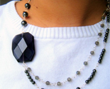 If your camera doesn’t support changing the white balance, you don’t want to mess around with RAW files, or you’ve already taken your photos, you can still tweak the levels a little bit in a photo editor such as Gimp (free) or Photoshop (not so free). On the right we have the same photo, but after using Photoshop’s “auto color” option. Note that “auto color” won’t work well on all photos, particularly ones without a lot of contrast. If you aren’t happy with “auto color,” hit undo and go to Image > Adjustments > Color Balance. Move the top and bottom sliders slightly away from cyan and blue to warm up your image.
Pass up the white background
 On the subject of white… sometimes a white background is best avoided all together. White backgrounds can be extremely tricky because they cause your camera to think the scene is lighter than it is, which can result in an underexposed photo. It also accentuates any unevenness or “hot spots” in your lighting. Post-processing with programs like Photoshop make things a little easier, but even then it can be hard to get an image that has natural looking shadows and edges.
 Colored backgrounds tend to be much more forgiving. Linen fabric makes a good backdrop, or lightly patterned cotton. Stay away from velvet unless you really know what you’re doing – it’ll look cheap if you don’t. And for heavens sake iron your fabrics before you photograph on them, everyone can tell when you just chucked an item onto the bed to photograph it.
Practice Makes Perfect
Taking good product photos is an iterative process. You just have to do it a lot to get good at it. Reading photography articles is great, but at the end of the day you just have to sit down and try a bunch of different things to see what works for you. Try not to get discouraged, it’ll come slowly but surely.
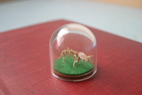
 I’m not sure how I neglected to mention this before… Tinysaur is now cheap viagra available for sale at ThinkGeek!


 Cropping the image just below the chest changes the aspect ratio of the photo and gives us a much more favorable crop (shown right). Just be careful you don’t cut it too short or you’ll start to lose some of the sides of the photo.
