edit: thanks everyone who submitted photos, the post is now up here!
I want to write an article on how to improve your photos, but I feel like it would be a little self serving to just throw up pictures of my own work, take better photographs, and tell you how great I am now.
So if you’re an Etsy seller (or any other online marketplace) drop me a comment with a link to your shop, and I will tell you what sucks about your photos, but in a constructive way! Because I’ll tell you how to fix it too. This is my way of appearing philanthropic while actually just telling other people what to do.
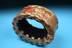
Now, I know what you’re thinking, “But Kellbot, your shop photos look incredibly mediocre. Why should we listen to anything you say?” And before pointing out that Roger Ebert hasn’t made any good films lately, I will show you proof that at one point, when I was less lazy, I did in fact take good photos of my work:
 |
Now, I was in art school at the time, so I went for the Official Art School Gradient Effect. I suggest you avoid this in your product photos unless you are in fact selling high end art. Frankly it just looks silly on Amy Butler fabric purses.
So leave a comment with a link to your shop, or email me at kellbot@gmail.com if you’re shy. C’mon, send me your bad photos! I promise I won’t be too mean to them.

I’d love some feedback! I know my photos aren’t great, but I’ve also seen worse…I take all my photos outside because I have such bad lighting in my tiny house. Any advice is welcomed…thanks!
Nikki
http://www.moondogfarm.etsy.com
I would love some helpful criticism! It is so hard to find advice for large objects!
http://www.etsy.com/shop.php?user_id=5870919
Jaci
ByTheWay
ByTheWayside
ByTheBy
My shop is just about empty, but you can pick it apart if you want; I know the the lighting is pretty horrible.
I’m game!
Sharon
http://www.knotoriginal.etsy.com
ok. I’d appreciate your advice..i know my pitctures need to be improved..but I’d like to know your point of view.
this is my etsy shop
http://www.andtherainfell.etsy.com
thank you!
One of the reasons I list so sparsely is feeling that my photos are mediocre – improving, yet still not showing product as I’d like. Constructive criticism would be welcome. Between my husband and myself we have 3 etsy shops:
http://glorioushats.etsy.com is my main place
http://feltsewcrafty.etsy.com is my destash shop plus more crafty items that I don’t want to mix with the hats
http://tranquilnook.etsy.com is the husband’s jewelry and a bit of mine
All photos challenge me, but the jewelry is by far the hardest to present well. Getting things to look accurate while still showing the beauty of the item.
Thanks so much for consideration. Best wishes with the article.
Jane
Thanks everyone, the post is now up here:
http://www.kellbot.com/2009/06/photo-tips-avoiding-common-mistakes/
hey..I hope its not too late to get some some helpful criticism:
http://www.elegantdreams.etsy.com and http://www.elegantswan.etsy.com
Thank you!